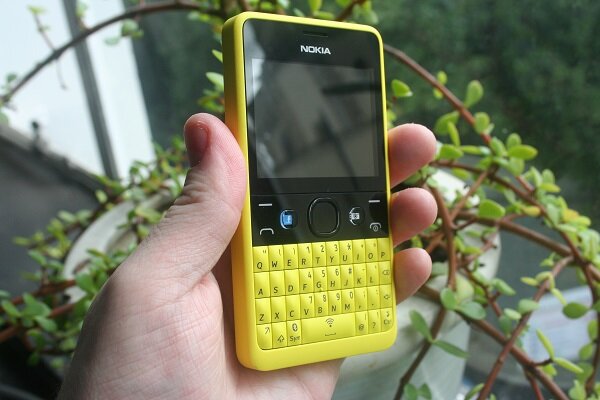
The recently released Nokia Asha 210 provides a smartphone option for those who want a physical QWERTY keyboard and do not want to fork out more than US$100. The new model improves on the Asha 201 and 205 at an affordable price.
Bandwidth Blog’s Theunis Jansen van Rensburg explores the good and the bad of the low-end smartphone.
Are you one of those people that love their QWERTY keyboards and don’t need a massively expensive smartphone that has one? This device might be for you, then. While the Nokia Asha 210 isn’t perfect, it certainly is a very compelling buy for people in this price bracket. Let’s find out why.
Announced last year, the Nokia Asha 210 offers the basics of what you’d expect from a modern mobile phone, in a package that is easy on your wallet. It is very similar to the Asha 201 and Asha 205, but with better specs.
Here are the specs it offers:
- 2 megapixel camera with 4x digital zoom
- Video camera, 176×144 pixels, 10 frames per second
- Display: TFT, 240 x 320 pixels (2.4 inches)
- Music Player with Audio Equalizer
- FM radio
- MP3 ringtones
- Connectivity: Wi-Fi, Bluetooth 2.1 with Enhanced Data Rate, micro-USB 2.0, 3.5mm audio jack
- Memory: 32MB RAM plus microSD card slot (up to 32GB supported)
- Battery: 1200mAh
The phone is quite boxy, but sits well in the hand and is easy to use, even if you have rather large hands. The buttons on the QWERTY keyboard are of great quality and is pretty ‘clicky’ and fast to master. The space bar doubles as an on/off Wi-Fi switch upon long press, and the symbol key on its left does the same for Bluetooth, which is very useful.
Build quality is very solid, and I’m pretty sure this little phone can survive quite a lot of drops and falls. You won’t notice any cracks or creaks in the casing and materials used don’t feel cheap at all. The glossy parts around the screen are pretty harsh on oily hands, with fingerprints easily visible
You’ll also notice two shortcut keys, one with a prominent Facebook, which as you can guess, is a dedicated Facebook key that opens up the Facebook app for you to immediately update your status and so forth. In select markets like India, this will be replaced with a button featuring the WhatsApp logo instead, for quick access to the free messaging service.
A basic 2.4” 320×240 pixels screen is what Nokia has chosen for the Asha 210, and its 169ppi density makes the new Series 40 UI appear somewhat pixelated, even from some distance. There’s a camera here, but it’s one of the most basic kinds possible, capturing grainy images at 2 megapixel resolution and some jagged video too.
The Asha 210 feels pretty slow with a basic ARM11 processor of undisclosed frequency, and just 32 MB of RAM. Going in and out of apps or simply strolling through menus takes quite a bit for modern standards.
The new Series 40 UI on the device doesn’t differ much from what we have seen before. Nokia is selling the 210 as a social and messaging powerhouse that would be suitable for the first phone of your teen, and WhatsApp as well as Facebook shortcuts are prominently placed on the homescreen. The WhatsApp application lets you quickly attach a photo from the gallery and shoot to your group on the fly.
This basically encapsulates what this phone is all about. It’s in messaging that the Asha 210 performs best. The QWERTY keyboard with a dedicated Facebook key comes into its own, even though the small display and old-style user interface work against the user. With email and instant messaging (Twitter, WhatsApp, and Facebook) easily available, and a native Facebook app, this is really a very good phone for teenagers or anyone who messages more than anything else on their phone.
Coming in at around R1 000, we can definitely recommend the device if you don’t need a powerful smartphone. This feature phone does everything it means to do well and in terms of social interaction and messaging, it is truly unmatched in its segment.


